Now on the agenda: Defining your retention metric! The goal here is to build this metric from first principles.
Before we go into the practical steps of how to select a metric that works for your business, some general words on why starting from first principles is so important here.
Performance metrics are a sensitive subject. Often, people just pick metrics and KPIs that are "industry standard" or copy ones that well-known companies use. Also, different people have different personal opinions, and incentives to choose a metric that benefits them.
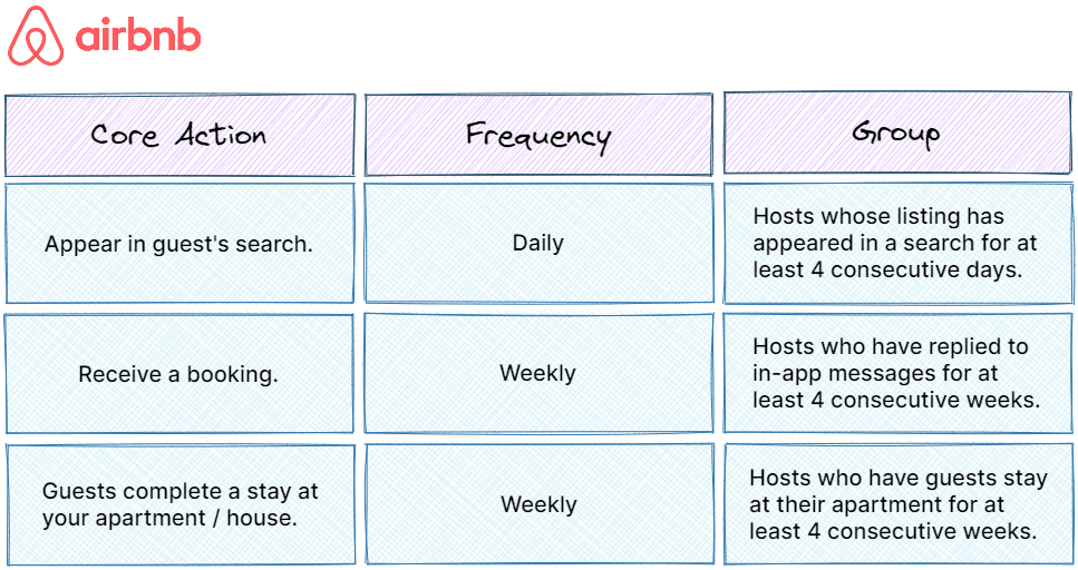
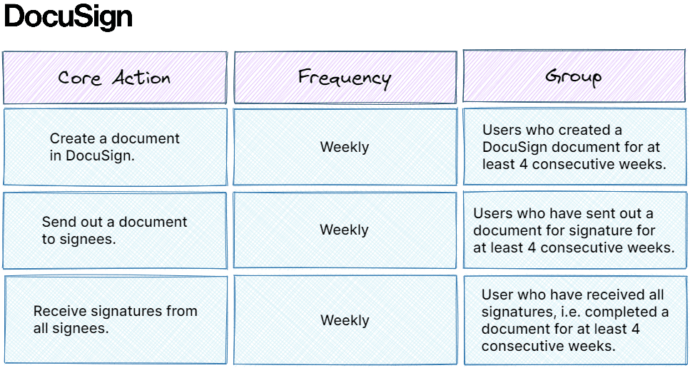
Let's look at some examples:
This thinking will lead to you straight to making a number of common mistakes:
At the end of all your efforts you want to achieve one thing: Higher retention. For that it’s important that users create a habit around your product. We’ll go into detail later, but one important tactic is to make use of notifications, so your users stay engaged.
If your target usage frequency is too high, then you’re just going to spam your users. Assume you have a product with a weekly or even monthly natural frequency. Your users are not going to appreciate receiving daily notifications trying to get them to open the app.
You wouldn’t like daily popups from Airbnb, telling you about hot deals, actions of your past hosts, or upcoming events (Airbnb Experiences). Spamming your users won’t increase usage – it will drive them away from your product.
Aiming for a frequency that’s too low will probably have no effect at all. Your users might still experience the problem but are going to forget about your product as a solution. You’re unlikely to build a habit around the apps if you only get a monthly activity summary from LinkedIn, or just a weekly list of new Slack messages.
If your metric is Daily active users + number of users who use feature A at least once a day + number of users who use feature B at least once a week you get exactly zero strategic guidance. A metric is meant to be a north start, helping you to prioritize growth tactics, or even your feature roadmap. With the above retention metric, you have too many options.
Even worse if you have a team that’s working towards improving the metric. They will almost certainly work on the easiest objectives and projects – which might not be the most valuable ones.
Yes, revenue is what you’re after in the end. But always remember: Revenue is just an outcome. You cannot improve revenue by itself. Inputs are acquiring more users or improving your retention and engagement → higher revenue will result from that. So, you got to focus on your inputs. Set your metrics around retention because that’s the part you can impact. Revenue will automatically follow.
Choosing the right retention metric is critical for building a sustainable, long-term profitable SaaS business. It’s also key for measuring growth and delivering value to the customers. By setting a retention metric, you’re setting a context for how you and your team thinks.
If you're setting a daily metric, you are going to build things that are going to influence a daily cadence for the user. The same happens with weekly, monthly, or any other action that you define. In essence: You need to be very careful with how you set this retention metric.
Let’s dive into how to do it right!
Getting a retention metric that’s suitable for your specific product and business requires three steps:
Frequency in which your users experience the problem.
Measuring retention on the wrong cadence can trick you into thinking your product has good retention when it really doesn’t.
As a first step, we’ll try to understand the natural frequency in which your users are experiencing the problem. While we already covered this in the previous section where we built a use case map, it’s only a qualitative hypothesis so far. Now we need to validate it with data.
We are breaking it down further into three concrete tasks:
This might sound intimidating, but it’s actually super easy.
In the use case map section, we have seen that circumstances between different use cases of your product can vary quite a bit. That’s why we will define a retention metric for each use case individually.
For the “host” use case of Airbnb we hypothesized that the problem occurs weekly. Most hosts will want to rent out their property as many days per year as possible. It seems ok to assume the average guest will stay for 3-4 nights and there might be one or two requests from new guests coming in per week.
If we suspect a weekly frequency, we’ll need all active users who have been on the platform for more than four weeks. If you’re suspecting a daily frequency, it would be the same. In the case of monthly you’ll need all active users who signed up at least three or four months ago, otherwise you won’t be able to spot patterns.
To create the frequency histogram, you’ll plot the number of users who have been active x number of days within the last 28 days. We will see soon what “active” means here.
In this histogram we can see that 1,200 users have been active 6 out of the past 28 days.
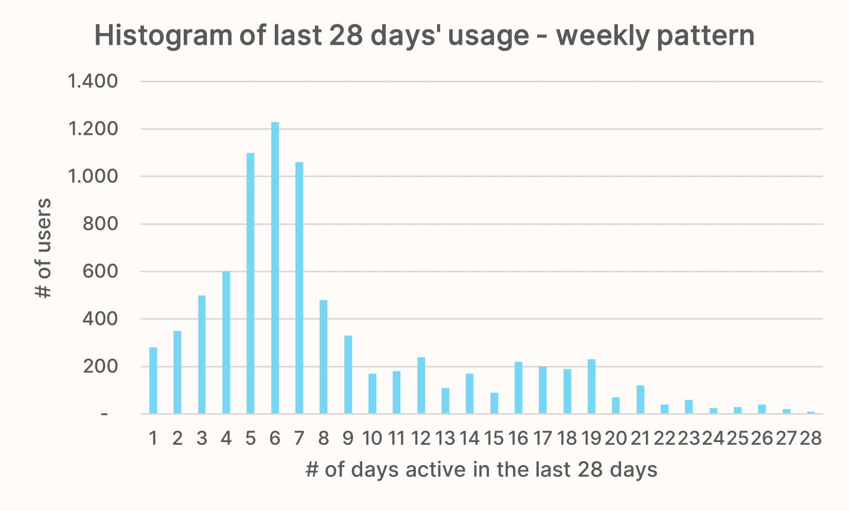
Ideally, there’s a clear pattern visible in the histogram. Let’s look at some exemplary charts to see how they’d be interpreted.
The following chart clearly belongs to a product with a daily natural frequency. Most of the users have been active 20 days or more within the last 28 days.
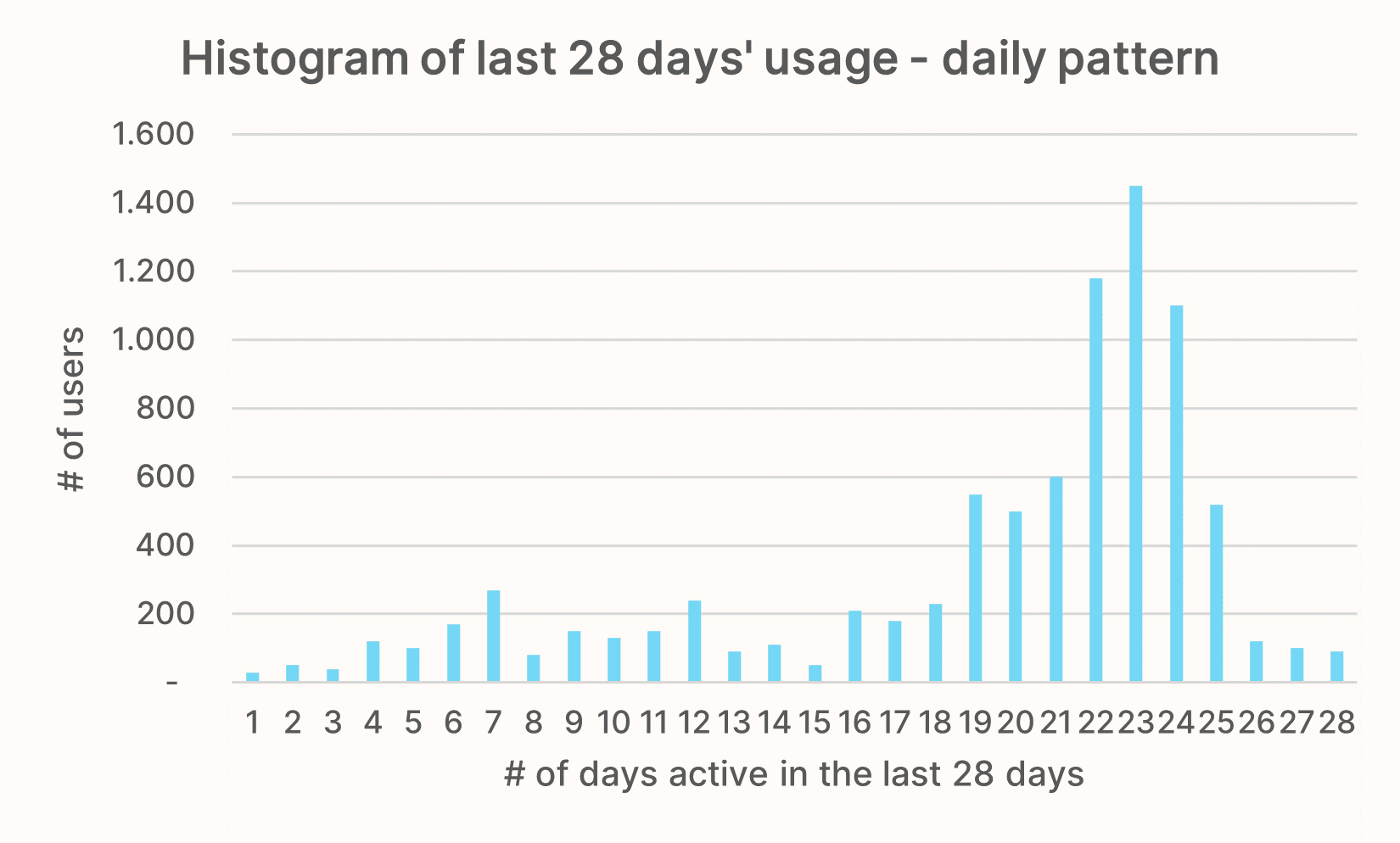
For a weekly frequency, there should be a clear peak of users active 5-8 out of the last 28 days. Given that a month (~28 days) has four weeks, this means that users are active roughly once per week.
Finally, for a monthly frequency we would expect the histogram to congregate towards 1-3 days.
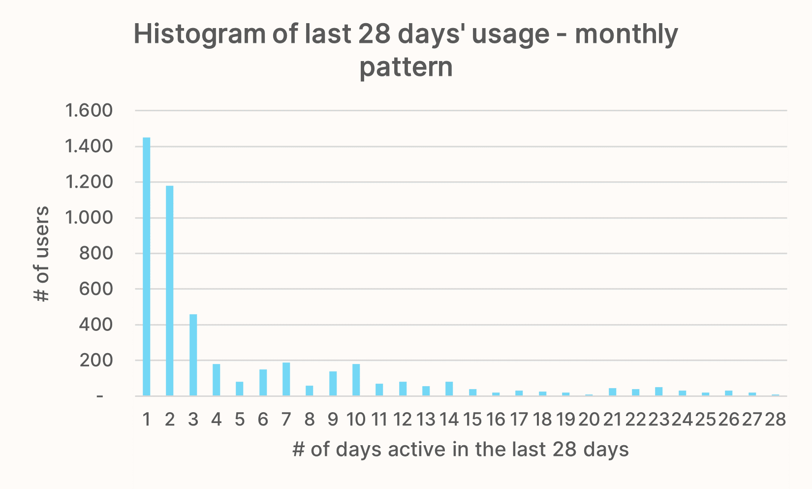
If your educated guess is that your product has a natural frequency greater than monthly, you can easily apply the same logic. Just extend the x-axis to cover a longer timeframe like three months (quarterly) or even twelve months (yearly).
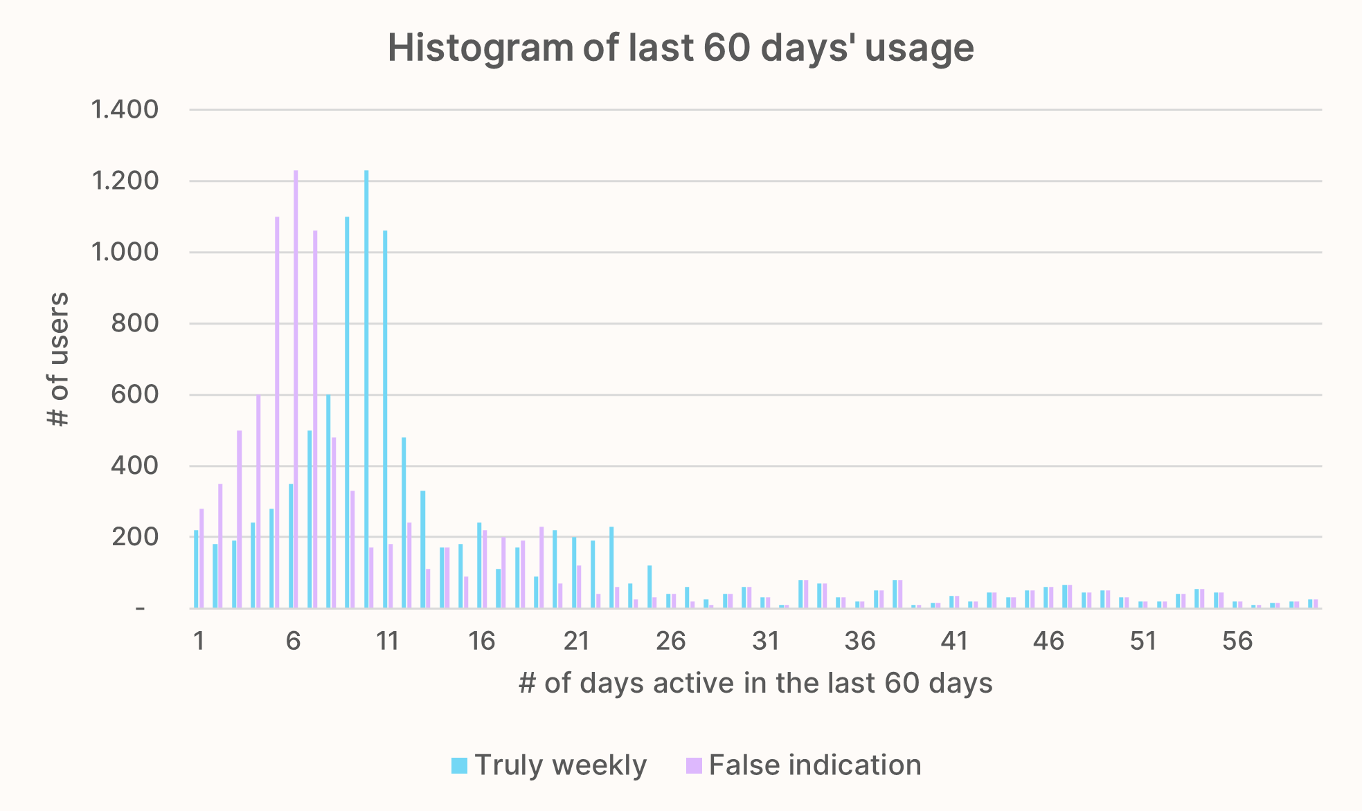
Pro tip: If you want to confirm that your histogram isn’t misleading, extend the timeframe and see what happens. If it indicates a daily frequency and you extend it from 28 to 60 days, does the peak area shift from ~23 to >50 days? For a weekly pattern, does it peak around 10 days if you extend the x-axis to the last 60 days?
The following chart shows the difference. In orange: How it looks like if the histogram stays the same even when looking at the last 60 days. This is a red flag that your frequency might not really be weekly. In blue: How it should look like to confirm a weekly frequency. The densest area has now shifted towards days 9 to 11.
You might be in the unfortunate situation that data doesn’t match your hypothesis at all. For example, you’re expecting a weekly frequency, but most users have only been active one day within the last month. This delta shows that your product is far away from what you want it to be. If you still base your retention metric on the weekly assumption, it’ll inevitably show bad retention.
You have two options:
When does the user experience your product's value?
The goal here is clear: Figure out which action indicated that you’re delivering value to your users. How is your product helping them solve their problem?
To do this, we will look at the action and tie it to the problem, and the “why” from our use case map. This will help us create a number of different hypotheses around the core action. The methodology is the same we took for the usage frequency: First come up with some qualitative hypotheses, then try to validate them with data.
We’ll go through this for two examples: The “guest” use case of Airbnb and DocuSign’s “collect digital signatures” use case.
Now that we have multiple core action candidates, we will — again — follow a three-step approach to validate our assumption:
First step: Create groups of users that have successfully completed the respective core action in multiple frequency periods. The tables below show this for each potential core action in our Airbnb and DocuSign examples.
If we assume that active Airbnb hosts receive booking requests on a weekly basis, we’d need to create group with all hosts who have received a booking request for at least 4 months in a row. The same works for monthly intervals. If you’re dealing with a daily frequency, I’d suggest slightly more like 6 successive days. In case of quarterly or even a yearly frequency, you can go lower to two or three consecutive periods.
Of course, building these groups requires that you properly track the main events in your product. You need to know which user performed which action at what time(s). If you don’t capture product analytics I would highly, highly recommend to setup a tool like Amplitude or Mixpanel to capture this data as soon as possible.
If you don’t have the necessary data available right now but still want to continue choosing a retention metric – which you should! – opt for the core action that’s most closely linked to your use case’s problem.
It might not be the perfect choice, but probably not too far off. Remember: Improving your retention is an iterative approach. You can’t work on it once and then you’re done but you will constantly have to re-evaluate your strategy. So, it’s better to start moving in direction that’s good but not 100% correct and adjust over time, then not getting started at all.
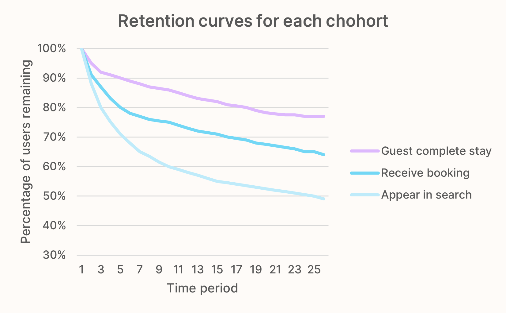
Armed with the group/core action pairs, you’re now plotting the retention curves for every case. We’re going to cover in the next lesson how to actually do this, but your chart will look similar to this:
You’ll get a retention curve for every core action candidate, showing you how the retention for each cohort develops. For example, the light blue line shows the retention rate for users in the "appear in search results" group.
Finally, now that you have all the retention curves nicely plotted, the question is what we can learn from it. Out of all the actions we have come up with, we want to identify the core action. That is, the user action that correlates with the highest retention rate.
Why? Because we want an action that signifies to us that the user has received value from the product. The assumption is that users who derive meaningful value from your product or service will stick around the longest.
You can also think about it the other way around: Let’s say we pick an action that without significant correlation to user retention, like a successful login. In order to improve your retention metric you will then focus on optimizing the login experience — which surely is an important part of the user journey, but completely meaningless if the product the user logs in to is useless for them. They will churn quickly, despite the seamless login experience.
Now back to our Airbnb example: Have a look at the chart and quickly think for yourself which core action we should pick as the winner.
The answer is: Have guests complete a stay. The retention line stabilizes and remains higher than those of all other core actions. Meaning “guests complete a stay” is our best shot at predicting a long-term retained user.
Side note: Of course, the numbers are made up. I don’t have access to Airbnb’s internal data. There are also good arguments to assume the “Receive a booking” action would be the best choice. But hosts want money (not just bookings), so factoring in cancellations a completed stay seemed for logical to me.
This uncertainty is exactly the reason why ideally you decide on a core action based on what the data, i.e. the retention charts tell you.
For DocuSign, I would expect the “receive signatures from all signees” action to have the highest retention rate. DocuSign could have an amazing editor to create documents, superb folder structure and tagging features to manage your documents etc. But if the signing experience would suck, would be buggy, or emails constantly landed in spam folders, users would churn. Creating documents is just a means to an end, what they really want are signatures.
There are two common mistakes that you should definitely avoid when identifying your core action:
Combining different actions into a new proxy action.
I highly recommend you to have a read through this concise and insightful article from Casey Winters, former growth leader at Pinterest. He shares the struggles Pinterest went through during their search for a north star metric. At some point, they came up with weekly active repinners and clickers (WARCs) as their core retention metric.
The main problem: It is way easier to optimize for clicks than to increase the number of repinners. Taken to the extreme, this will incentivize users to share clickbait, because this kind of content gets the most clicks. But it’s an “empty calorie” since it doesn’t provide any value to the users. You click on it, realize it’s clickbait, then leave disappointed.
Your goal is to find the simplest core action that indicates you’re delivery value to your users.
Using revenue metrics.
We went through this earlier, so I’ll leave out a more in-depth explanation here. Remember: Revenue is always the output. It is not possible to improve revenue as it as — you can only grow it by getting better at customer acquisition or retention. So, if you make revenue your north star metric that you want to improve, it gives you zero practical guidance on how to achieve it, or which projects and features to focus on.
Define which type of user/persona your metric should represent.
Among the most common retention metrics are Daily Active Users (DAU), or the equivalent for weekly (WAU) and monthly (MAU). Problem: They are quite vague if you haven’t defined what a “user” is.
That’s why as the last step of our quest to choosing a good retention metric, we’re narrowing down who should be represented by that metric. On the use case map, we called this the persona. This, again, is dependent on the use case.
Quick reminder: If your product has multiple use cases, they will have different problems, usage frequencies, personas, and finally retention metrics.
Clearly defining who the persona is for the use case provides additional context. This background info comes in handy once you or your team are actually going to draft projects to improve your retention metric.
Putting it all together to get a suitable retention metric for your business.
Let’s now put all the puzzle pieces together and finally define some retention metrics! The next chart shows the three building blocks (frequency, core action, persona) plus a potential retention metric for some of our example companies.
Use case | Frequency | Core action | Persona | Retention metric |
---|---|---|---|---|
Pinterest — Browsing Interests |
Weekly | Repin | Repinner | Weekly Active Repinner |
Pinterest — Planning a project |
Daily | Repin | Repinner | Daily Active Repinner |
Airbnb — Guest | 1-5x per year | Booked stay | Guest | Yearly Active Guests |
Airbnb — Host | Weekly | Guests completed stay. | Hosts | Weekly Active Hosts |
DocuSign — Collect digital signaturess |
Weekly | Receive all signatures. | "Signature collector" | Weekly Active Signature Collectors |
DocuSign — Create quotes/ offers |
Weekly | Send document. | Sales representative |
Weekly Active Sales reps. |